Concept & Inspiration
The main goal behind TEGEL was to create typography that makes no apologies for taking up space. The project’s name is a direct reference to the former Berlin airport, reflecting its raw, almost engineering-like character. It serves as a nod to brutalism and functional urban infrastructure. Here, form follows function, but ultimately becomes the primary message itself.
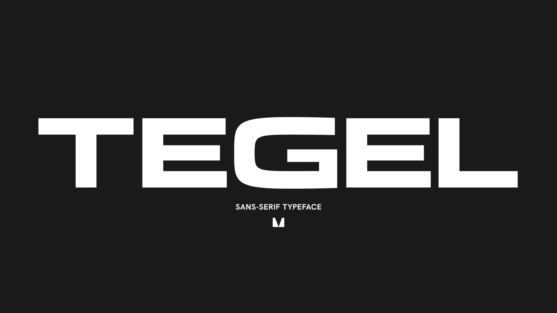
Anatomy & Details
What sets TEGEL apart is its extremely extended proportions, which naturally enforce a horizontal rhythm and structural stability. The character construction relies on technical, geometric shapes reminiscent of navigation systems and machine-readable fonts (OCR). Wide inner spaces combined with strong vertical strokes ensure high legibility. The typeface offers an extreme contrast in weights—from a technical, precise Light version to a massive, heavy Bold that builds immense visual tension.
In Use
TEGEL does not like silence. It is a typeface built for high-impact layouts that thrives in large scales. It is perfectly suited for large-format posters, album covers (especially within the electronic and techno music scenes), bold typographic branding, and modern web design.