The concept of Polor Studio is built on a dual foundation: the literal "polish" of visual brilliance and the symbolic "polor" representing high personal culture, tact, and sophistication.
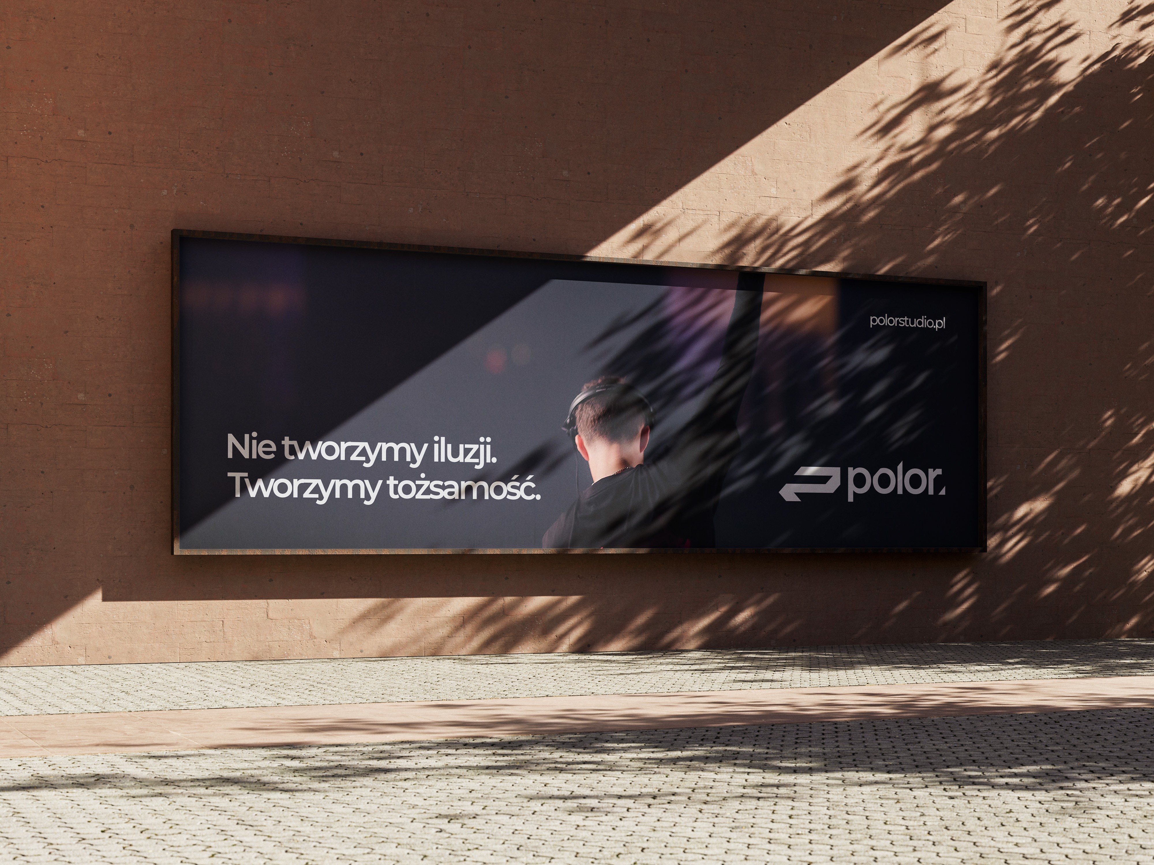
The core challenge was to design an identity that feels premium and stable, yet pulses with the energy of the event industry. To achieve this, the logo was evolved into a bold, condensed icon—a streamlined "P" that functions as a "fast-forward" symbol. This shift from a traditional mark to a high-impact signet reflects the agency’s commitment to growth and rapid, high-quality execution.
The branding utilizes a minimal yet aggressive design language, blending clean typography with sharp, geometric contrasts. We developed a modular ecosystem designed for high visibility, whether on a massive festival screen or a minimalist digital interface.
The result is a timeless, professional identity that communicates aesthetic clarity and relentless momentum, positioning Polor Studio as the definitive creative force for the modern cultural landscape.